By using an online grant management system like GO Smart, you will have a giant pool of data at your disposal to help tell your stories. When you want to tell your story with data, you may not be a graphic designer (or a millennial!) but you can easily pull statistics or trends from your data and show decision makers in your community how much of an impact your grants make. We’ve broken this down into three easy steps:
- Determine the right metrics
In order to get the right data from your applicants, it helps to start backwards. Before launching a grant is the time to think about your stories. For example, if the story you want to tell is how many people in your community benefit from your grant funding, you’ll need to determine what metric will be used to tell this story. Metrics could be the total number of attendees, a breakdown by demographic or region, or some other measure. Think about what is most important to your organization—your mission is a good place to start. Keep your story focused on your top 3-5 metrics so your audience clearly understands your goals.
- Consider your audience
How can you make this metric digestible for your audience? Consider how best to present the data: should you use totals, averages, percentages? Large total numbers are great for highlighting impact, but a percent increase over the past year would better demonstrate growth.
- Visualize your data
Once you have determined your metric and retooled it for your audience, then think about the best way to visualize it. Jazz it up even more like the example below by playing around with color, icons, and fonts.
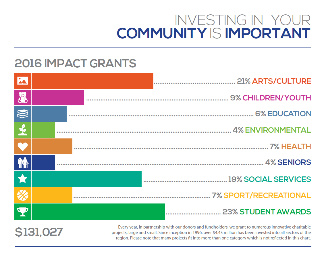
There are many tools available to quickly visualize your data. Websites like venngage.com offer infographic templates that go beyond simple graphs and charts. Use icons and pictures to talk about your data. In the example below, you can see that the right mix of text and graphics helps to highlight visually the impact. It also includes a call to action that links back to the organization’s website.
Remember that the biggest hurdle for creating these stories is the data. . .and you’ve already got that in spades. Consider how the information you’re gathering during every step of your grant process might be used to tell compelling stories.
Tell us below how you use your data to tell your story, or click here to schedule a demo and find out how GO Smart can be a part of your storytelling!